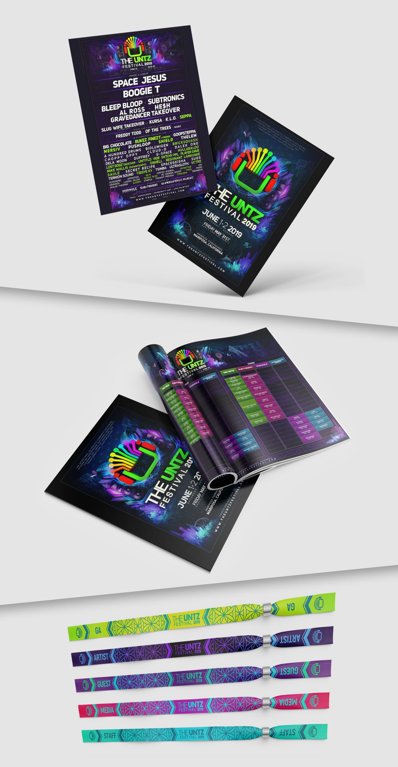
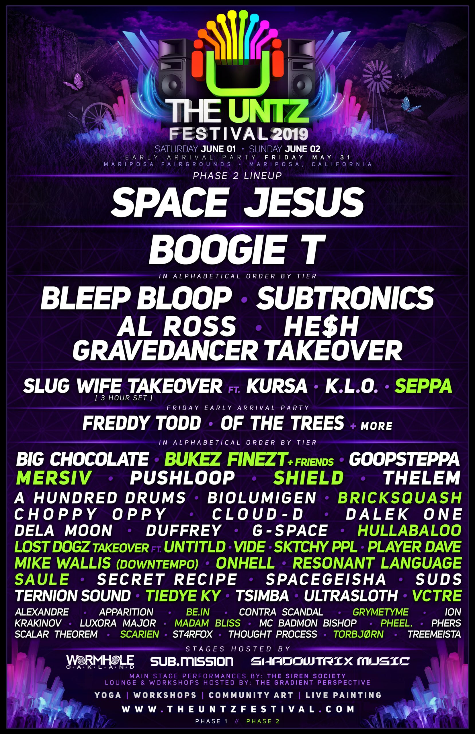
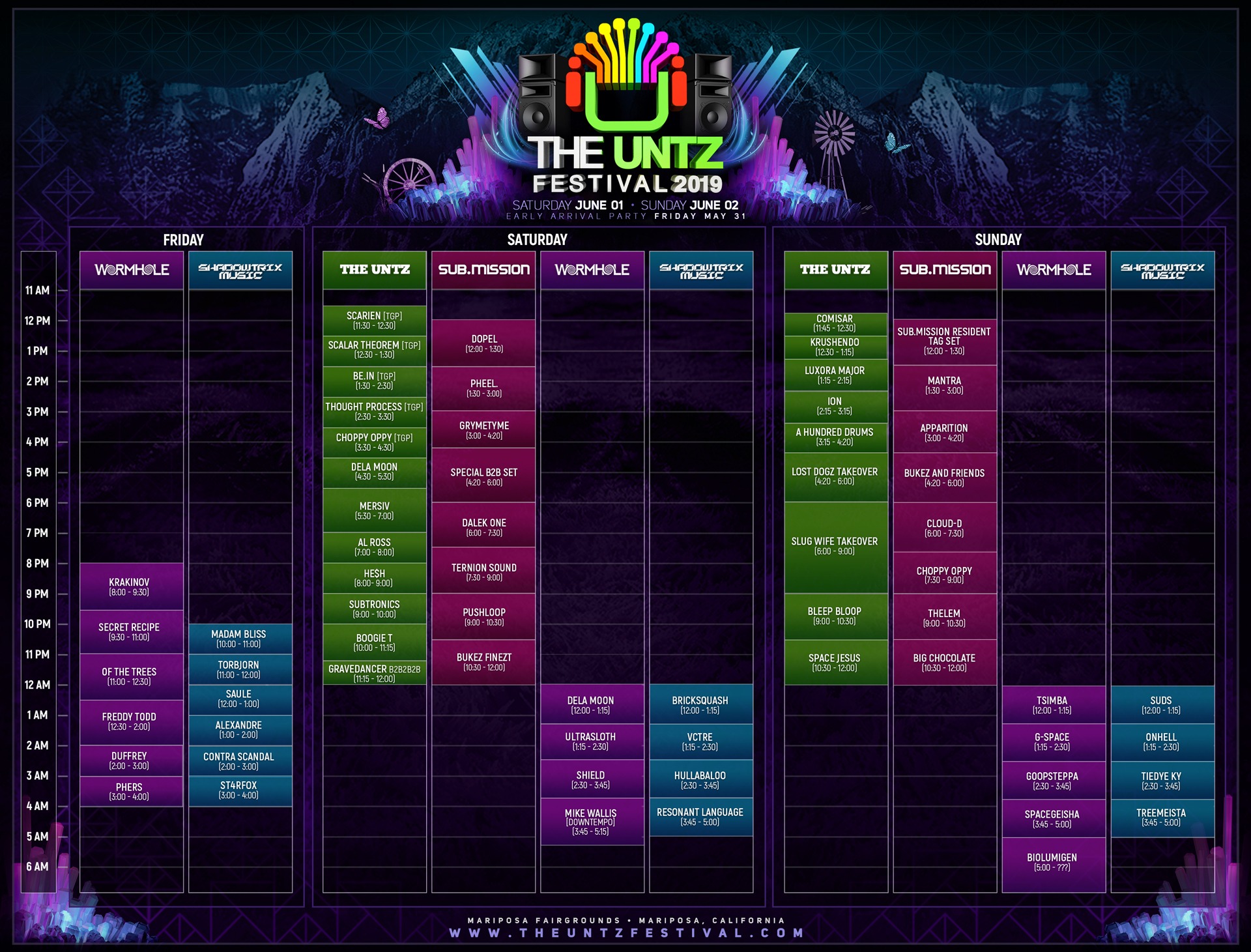
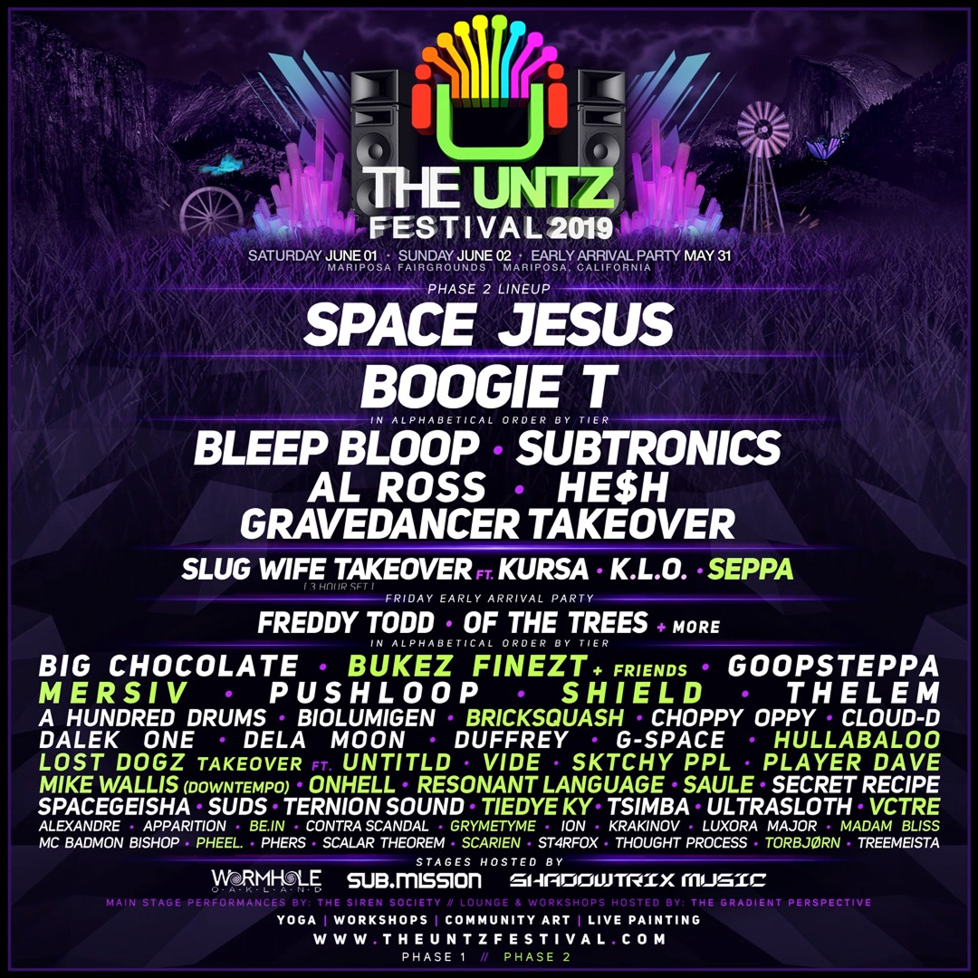
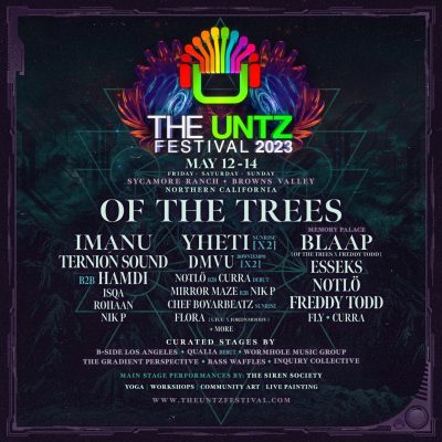
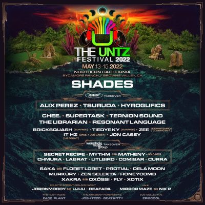
By year three I felt like the daytime, golden-hour look had run its course, so I flipped the whole thing to night. Cool blues and glowing violet crystal clusters replaced the earth tones, and I added a windmill silhouette on the horizon as a quiet nod to place without repeating the wagon-wheel motif again. This was the year I started thinking of the mascot less as a mountain-festival logo and more as a beacon — something glowing in the dark that pulls you toward it. The lineup poster also got noticeably cleaner and more type-driven; I trusted the artwork less and the typography more.